Bespoke made in 10-12 weeks
  National Installation
  Worldwide Shipping
In my own period home, there’s cabinetry that’s been here for over a century — beautifully made and still doing its job. […]
Read more
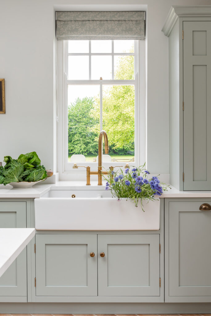
A Guide to Vintage Kitchen Cabinet Hardware
Whether you’re renovating a Georgian rectory or adding character to a contemporary home, appreciating the history of classic British kitchen hardware (often […]
Read more
The Rise of the Dirty Kitchen
What’s being called a “dirty kitchen” is becoming a popular request in modern homes—but the idea isn’t entirely new. These spaces borrow […]
Read more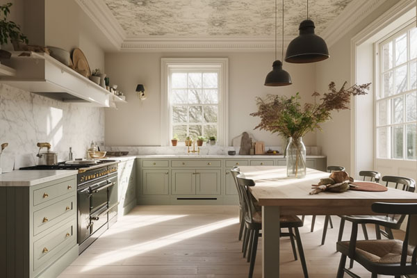
Designing a Kitchen for High Ceilings
High ceiling kitchens can create an open, airy feel, adding a sense of grandeur to the space. However, designing a kitchen with […]
Read more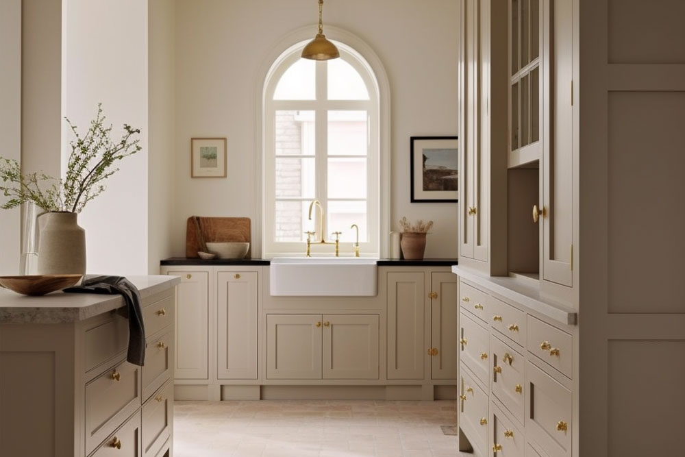
Kitchen Trends 2025
Dirty Kitchens: The Emerging Trend for 2025 In 2025, the “dirty kitchen” trend is gaining popularity. This concept, also known as a prep kitchen […]
Read more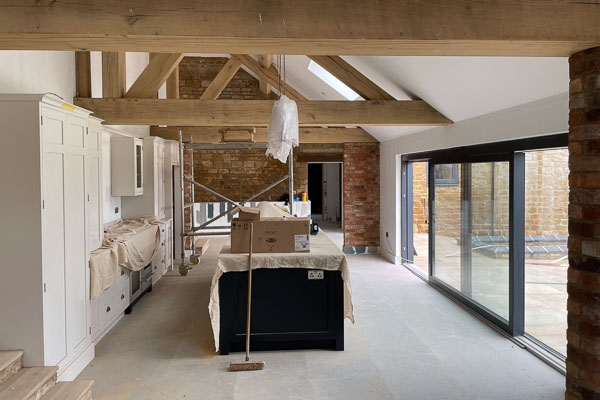
From Barn to Home in 365 Days
In the heart of the Northamptonshire countryside, Rachael and Angus Wallace found a hidden treasure: a centuries-old barn that once belonged to […]
Read more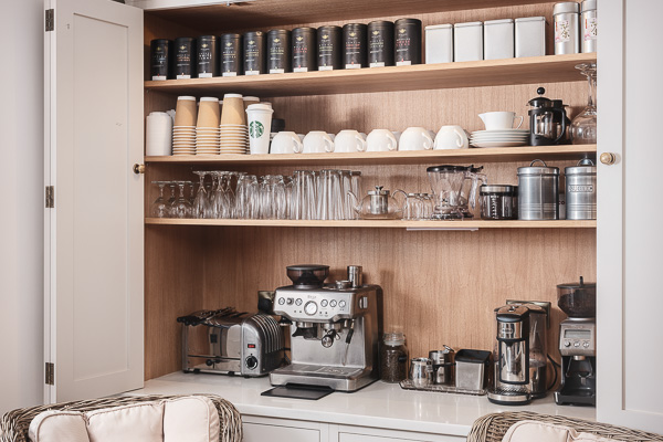
Creating the Perfect Bespoke Coffee Nook
Creating a coffee nook is all about designing a practical, convenient space where you can enjoy your morning brew. It brings everything—your […]
Read more
Behind the Scenes at The White Kitchen Company
Welcome to “Meet the Makers,” our latest feature that delves into the lives of the people who make The White Kitchen Company […]
Read more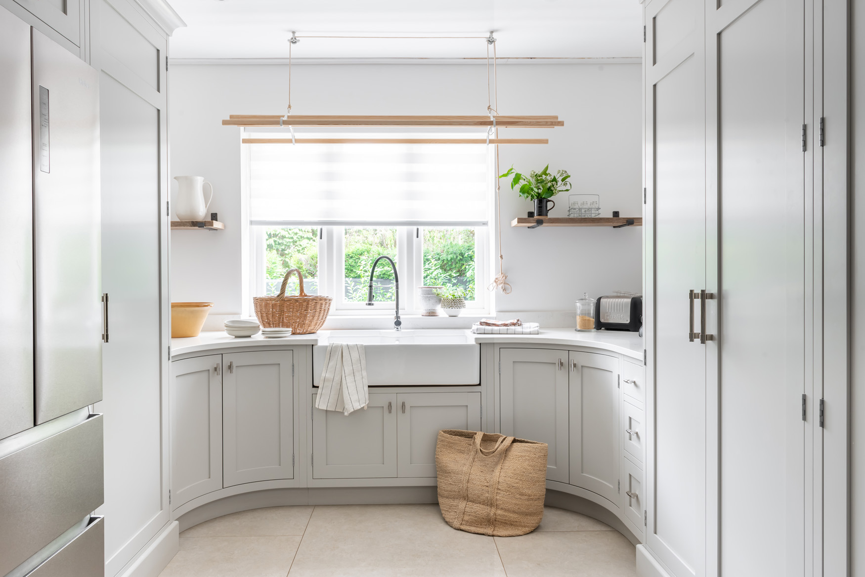
Thinking of Renovating your Home?
We talk to Marigold and see how she did it… The creation of St. George’s Hill in Weybridge, built around a golf […]
Read more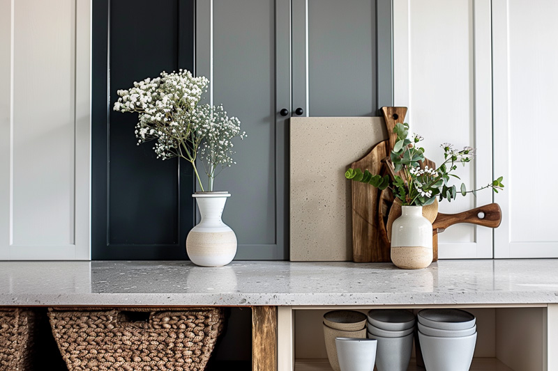
Kitchen Colours
Let’s explore some popular kitchen colours and how they can transform your home. Your kitchen is more than just a place to […]
Read more