Goodbye minimalist design and hello, colourful maximalism! Denby has always been a champion of colour and glaze and has entered the new year celebrating life in colour. Here, their Design Director Richard Eaton tells us the best ways to bring mood-boosting colour palettes back to our interiors.
Often, we can fall into the trap of designing neutral, minimalist interiors in an attempt to make them ‘timeless’. However, this can often leave our homes feeling a little impersonal or uninspiring, which is particularly noticeable as we begin to spend more of our work and leisure time at home. Our surroundings have a huge impact on the way we think, feel, and behave, so we believe it’s time to inject some joy and personality back into our décor.
From colour psychology to expert trend predictions, below we’ve shared our top tips for refreshing your interiors with a pop of colour this year.
Colour and mood
If you think your home isn’t living up to its full potential, colour psychology can be an excellent place to start. Colour psychology studies how different hues affect our mood, behaviour, and emotional responses, which can help to inspire some very effective changes in your interiors. So, when deciding on a fresh colour palette for your home, try to tune in to how these shades really make you feel when they’re used in a room, regardless of how stylish or on-trend they may be. This can help you avoid interior design fads that don’t really suit your home or your personality.
Consider the desired mood of each room
©Denby
If different colours can influence the way we feel, it helps to establish what mood you want to create in each room of your house. This way, you can experiment with colour accordingly and have a clear direction for each space.
Bedroom: Colours on the cooler side of the spectrum — blue, purple, and green — are typically seen as calm, soothing shades that inspire relaxation. So, experimenting with these cool tones in your bedroom can help your brain associate this space with rest and relaxation. Pastel shades can feel less dark or imposing, but if you have a large bedroom with plenty of natural light, you can get a little more creative with paint, bedding, and soft furnishings in deeper hues.
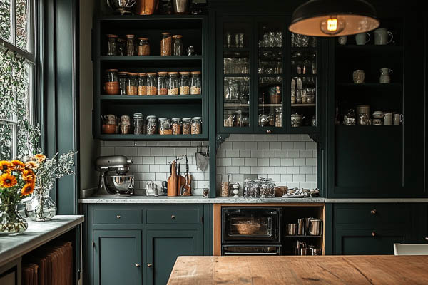
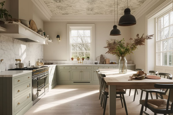
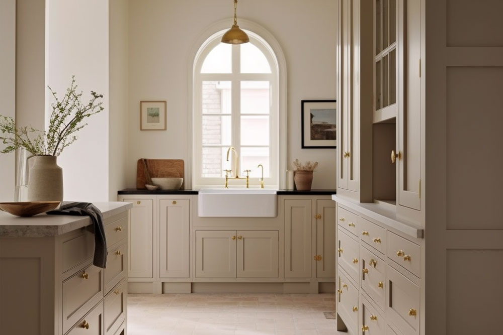
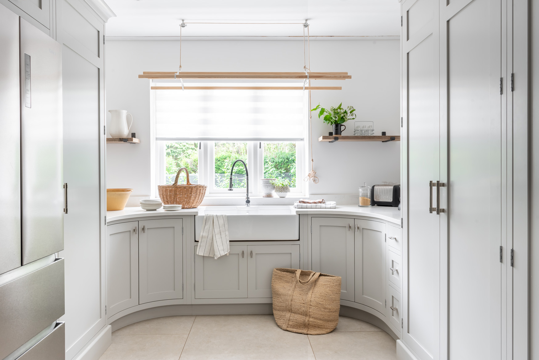
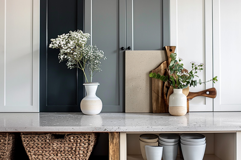
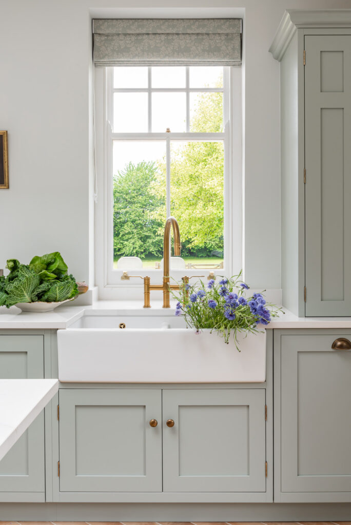
Kitchen: Depending on the layout and functionality of your kitchen, you may instinctively opt for a classic, neutral palette of white, black, or cream. However, to incorporate a little more personality into your kitchen, why not try colours on the warmer end of the spectrum? Shades like baby pink, powder yellow, or muted orange can help your kitchen feel livelier and more welcoming, which is perfect if you enjoy hosting. You can add pops of colour to light-toned cabinets and worktops by picking out staple pieces of homeware and ceramics in bolder, more invigorating shades within the same colour palette.
Living room: As a colour associated with freshness and contentment, green can be an excellent choice for a living space. Forest and emerald greens are also proving to be incredibly popular in the design industries this year. Especially if your living room looks onto a garden through French doors or a conservatory, using green can be a great way to bring some of the great outdoors into your interiors and blend the two environments together. If you don’t want to make any permanent interior changes just yet, you can also play with this through finishing touches like a ceramic jug filled with fresh-cut flowers or trailing evergreen houseplants.
Create a complementary palette
When you find the perfect colour you’ve been looking for, it’s easy to get carried away and start looking for paint, furniture, and décor in all the same shade. However, this can often look slightly overwhelming and means your interiors can lack depth, texture, and contrast. This is why it’s important to create a colour palette for your design ideas before you start refreshing your interiors.
To identify your complementary scheme, start by simply combining colours from opposite sides of the colour wheel. This will give you a core complementary colour, which you can then vary by using a variety of different shades, tones, and patterns. For example, blue and orange combine to make brown: so, if you’ve picked out wallpaper or statement homeware in these vivid colours, they’ll pair perfectly with furniture like a brown leather sofa.
Consult the colour experts
©Denby
You may have a clear vision for how to incorporate more colours into your home, as well as some favourite hues you’d like to try out. However, if you’re lacking in inspiration or don’t know where to start, a great way to find new ideas is by consulting Pantone’s Colour of the Year. The experts at the Pantone Colour Institute analyse everything from the fashion, entertainment, and design industries to travel destinations, new technologies, social media trends, and even the social climate, and identify colour influences that capture the essence of the year ahead.
The shade announced as the colour for 2023 is Viva Magenta, which the Colour Institute describes as brave, fearless, and optimistic. This is perfect if you want to inject your interiors with more self-expression and experiment with something a little bolder this year. As a bright, vivid member of the red family, you may not opt for large swathes of this colour on your walls or floors. Instead, you can start by experimenting with accents around your home, such as soft furnishings, ceramics, or wall art with splashes of magenta.
Use these tips from the homeware experts at Denby and start designing more uplifting, mood-boosting interiors. For more inspiration on beautiful kitchens and timeless interior design, be sure to check out the rest of our blog.